
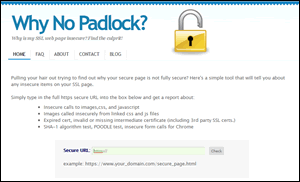 If you recently added an SSL certificate to your site, your visitors may still be seeing security warnings. The reason can be because not all links in your site have been updated from http: to https:. This free easy-to-use tool will identify the references that need to be fixed.
Category Archives: Web Design
Free Help
Watch this video to learn about our offer of free help.
Mobile Web vs. Full Site Web – No Compromises
 There is a false debate raging in the world of usability, among its scientific practitioners.
Some like Jakob Neilsen argue that mobile users and desktop users have different objectives. They contend that the only way to address these disparate needs is to create separate sites with different content structures. This multi-web approach places extra demands on designers and content producers. While it might seem like a boom to web developers, it is impractical to expect small businesses to manage multiple sites. Without small business participation the growth of online commerce will stall. Consumers will be disheartened by a patchwork that includes inadequate mobile specific sites; mobile apps with limited functionality; traditional desktop sites that do not translate to mobile; and poorly designed responsive sites.
Not only will we have two (or more) webs that narrowly focus on screen size, we will also have two classes for online commerce.
Smart phones and tablets are disruptive technologies. They upset the settled conventions of desktop usability. While some users remain wedded to large screens and others are mobile-only, many more are apt to access the web with multiple devices. It will take time for things to settle out. Meanwhile HTML5 and CSS3 have arrived in the nick of time and responsive design seems to be gaining steam.
The truth is that we are witnessing an evolution. Mobile technology is still changing. Sooner or later the web and users will adapt to the new realities. Judging by the pace at which changes is happening, I predict it will be sooner rather than later. I also predict that a single web solution will prevail.
If we accept these predictions as inevitable, it becomes easier to envision how things will be in this new era. Desktop users will accept a simplified landing page that might require an extra click to reach content. Meanwhile mobile users will adapt to new types of navigation so they access the same content available to PC users. As users adapt, usability experts will concoct new standards and designers will create presentations that incorporate them. It is already starting to happen.
Both sides in this debate should simply back off. Stop thinking about compromises and start thinking evolution.
Keywords vs. Quality Content

Keywords are important – no doubt. Bit by bit Google and the other search engines are creating new ways to evaluate your site and direct searcher to quality results. Sites that pack keywords in their titles, headings, and tags are coming under closer scrutiny. If the site is also packed with ads and thin content, Google will penalize the site. Thin content includes things like external links that have no relevancy to the presumed purpose of the page and content copied from other sites. Google gives bonus points to original, helpful, and relevant content. When linking to external sites it should be done in the context of providing more information for users wanting to explore the topic more after consuming your content. A page with a list of plain links probably won’t impress Google much. Google also loves videos and original images. They imply a content rich site. Remember – Google owns YouTube. Stay away from schemes to have your site listed on hundreds directories in order to boost your results on search engines. If Google identifies those directories as link farms, your ranking will crash. Stick to “white hat” techniques. If you have quality and meaningful content for your target audience, Google wants to find you. Follow their guidelines and you will be rewarded.
What Does Online Execution Mean?
Online execution encompasses more than throwing up a pretty website.
A well-designed site begins with an understanding of the target audience – specifically your ideal customers. Profile them. Identify what they will be seeking when they visit your site.
Will your ideal customers be using your site from mobile devices? In most cases the answer is yes. Also, in most cases they will sometimes be using desktop computers, too.
Are your ideal customers social? In most cases the answer is yes. What networks are they using?
What are your business objectives in being online?
How will your online presence integrate with your offline marketing?
All these factors and more need to be considered before committing a single line of code.
This blog will provide some guidance to entrepreneurs and business owners developing their online strategies. If you know someone who would benefit from a little help, share this link.